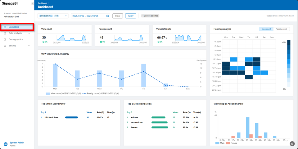
Dashboard
This page displays the statistical results of the signage effectiveness analysis under the selected company. It presents various KPI metrics, including View Count, Passerby Count, Viewship Rate, Heatmap Analysis, WoW Viewership& Passerby, Top 5 Most Viewed Players, Top 5 Most Viewed Media, and Viewership by Age and Gender.
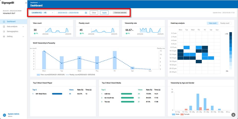
Users can filter the data by location and date to view corresponding statistics.
Detailed KPI Descriptions
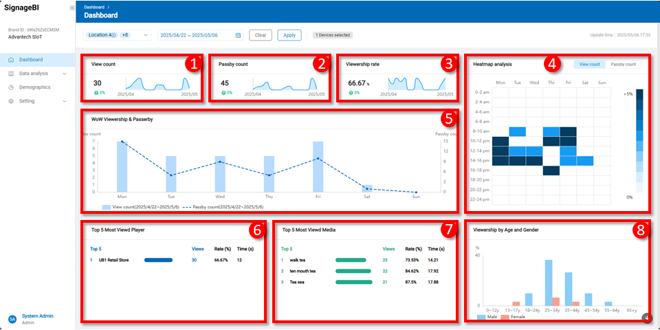
1. View Count This metric calculates the total number of valid views within a specified time period using facial recognition. A view is recorded when the system detects a viewer facing the screen and maintains attention for at least 3 seconds. The system aggregates view counts across time intervals and provides comparative growth or decline between time points. A wave chart is used to visualize viewing trends, helping managers quickly identify peak periods and assess content performance. Displayed data includes: (1) Total Views: The total number of valid views collected via facial recognition during the selected time range. (2) View Comparison: Growth or decline in view count between the start and end of the selected period. (3) View Trend (Wave Chart): Viewing fluctuations between the start and end times, shown graphically.
2. Passerby Count This shows the total number of people who passed within the detection range of the signage during a specified time. It includes both valid views and passersby who did not stop. This metric helps assess overall foot traffic and potential signage reach. It supports time-based comparisons and visualizes traffic flow trends using a wave chart, aiding in strategy optimization. Displayed data includes: (1) Total Passersby: Combined total of valid and invalid viewers during the selected period. (2) Traffic Comparison: Rate of increase or decrease in passerby count compared to the previous time period. (3) Traffic Trend (Wave Chart): Trend of people passing through the area over time.
3. Viewership Rate The view rate represents the percentage of passersby who actually viewed the screen, indicating the content’s attractiveness. The system calculates average view rates and visualizes trends over time to assist in optimizing scheduling and content. Displayed data includes: (1) Average View Rate: Percentage of valid viewers among all passersby during the selected period. (2) View Rate Comparison: Change in view rate compared to the previous time period. (3) View Rate Trend (Wave Chart): Visual representation of rate fluctuations across the selected timeframe.
4. Heatmap Analysis This chart visualizes the distribution of view or traffic data across days and time periods. X-axis: Monday through Sunday. Y-axis: 24-hour format, segmented in 2-hour intervals (e.g., 0–2, 2–4, etc.). Heat Levels: Data is divided into 11 intensity levels. Each cell value is calculated as a proportion of the total, indicating the concentration of activity in that time slot.
This analysis helps identify peak engagement periods and optimize scheduling or space usage accordingly.
5. WoW Viewership & Passerby This visualization compares daily viewing behavior over a one-week period. X-axis: Days of the week (Monday to Sunday). Y-axis (Left): Average number of views per day (Bar chart). Y-axis (Right): Average viewing time per day in seconds (Line chart). This dual-axis chart helps identify which days receive the most attention and viewer retention, supporting better content planning and scheduling.
6. Top 5 Most Viewed Players This table lists the five players with the highest number of valid views in the selected time range. It helps managers identify top-performing display units and their engagement performance. Displayed fields: Top 5: Player names ranked by view count. Views: Total number of valid views for each player. Rate: Ratio of valid viewers to passersby. Avg. View Time: Average viewing time per viewer for each player.
7. Top 5 MostViewed Media This feature highlights the top five media assets with the highest view counts in the selected timeframe. Through a visual table, users can easily identify the most engaging media items for performance evaluation and strategy refinement. Displayed fields: Top 5: Media names ranked by view count. Views: Total valid views for each media item. View Rate: View percentage based on passerby data. Avg. View Time: Average viewing time per media asset.
8. Viewership by Age and Gender This feature provides a demographic breakdown of valid viewers by gender and age, using data collected from the facial recognition system. It supports content targeting and audience segmentation. X-axis: Age groups: 0–12, 13–17, 18–24, 25–34, 35–44, 45–54, 55–64, 65+. Y-axis: Number of valid views. Male viewers are shown in blue, female viewers in red. This visualization helps compare engagement across demographic groups and fine-tune content accordingly.