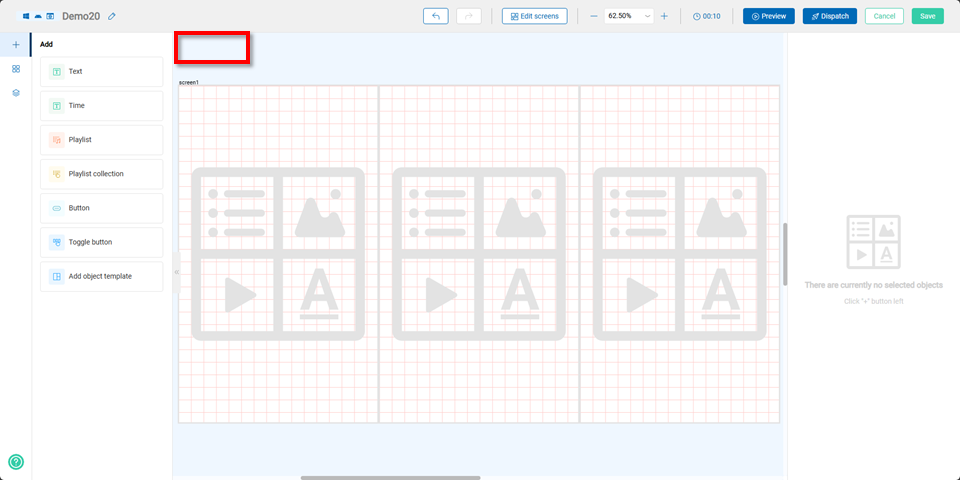
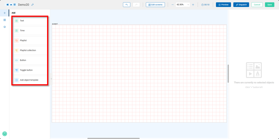
Components
Users can add various components including "Text, Time, Playlist, Playlist Collection, Button, Toggle Button, and New Template Object."
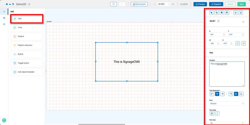
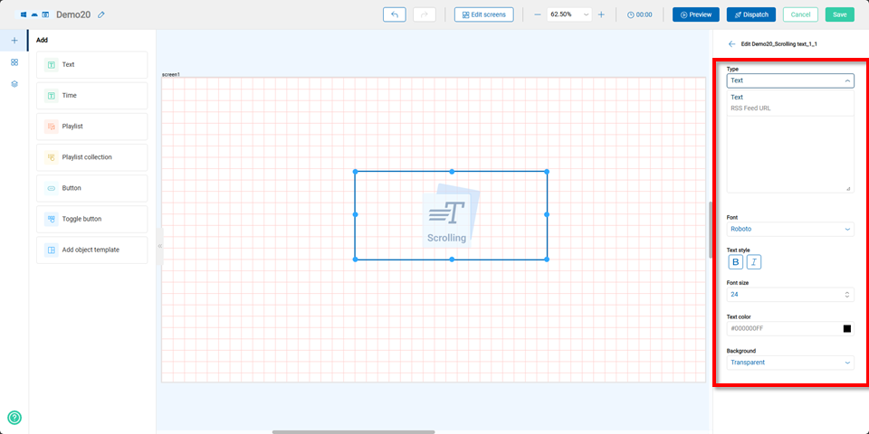
Text Component
After creating a new text component, users can edit its coordinates, size, content, text alignment, font, text style, font size, text color, background color, image stretching method, and data source on the right panel.
Note The data source can be replaced with a text file. Once replaced, users can simply modify the text file to update the text.
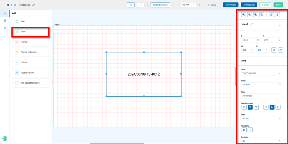
Time Component
By selecting the time component, users can edit its coordinates, size, date, day of the week, time, text alignment, font, text style, font size, text color, background color, image, and stretching method on the right panel.
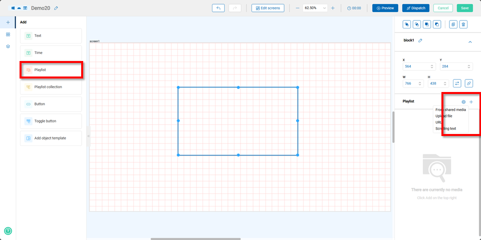
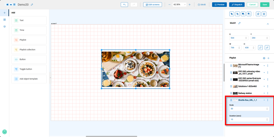
Playlist Component
When selecting the playlist component, users can edit its coordinates and size on the right panel. By clicking the "+" button, users can choose to add playlists from shared media, uploaded files, URLs, or a scrolling.
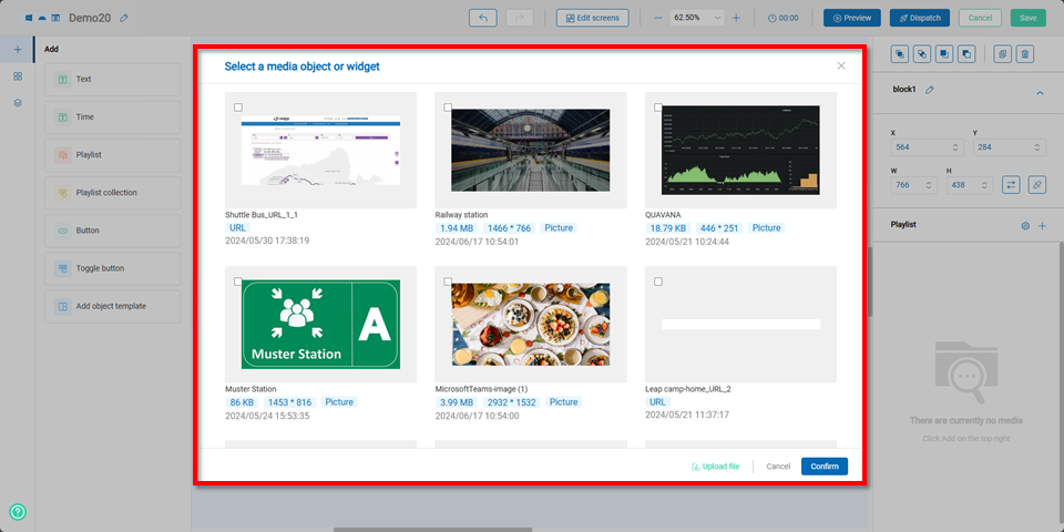
Shared Media
By choosing shared media, users can select files and then it will shows in the shared media.
When adding media files, the media will show at the playlist.
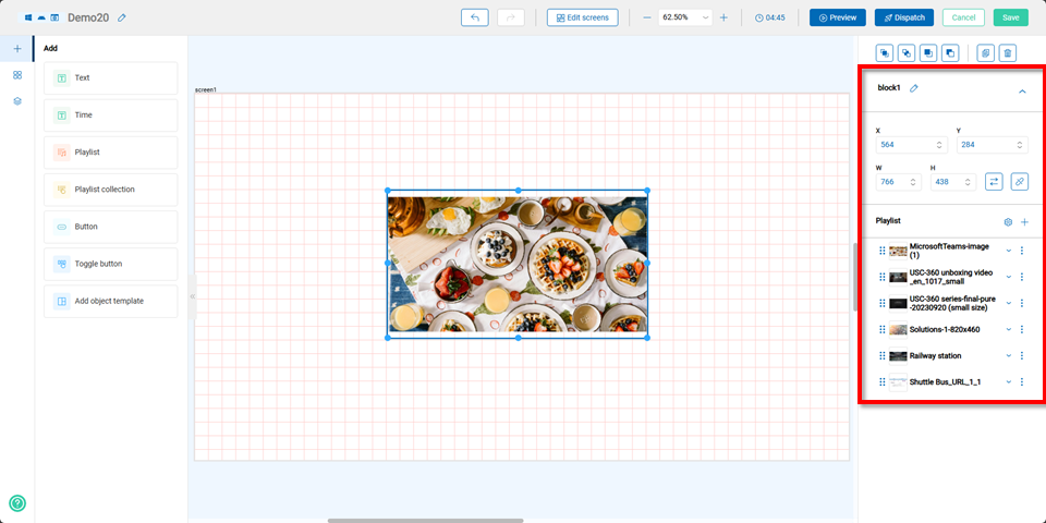
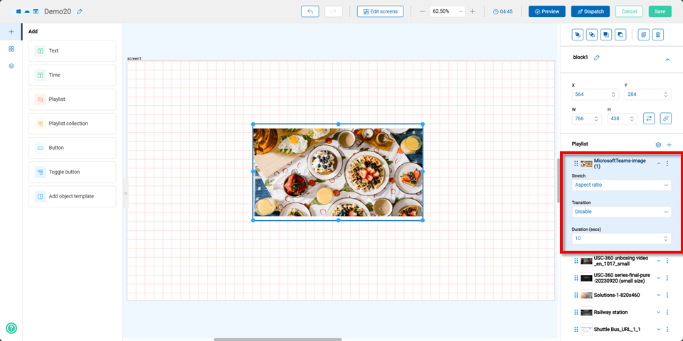
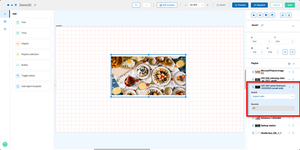
If the playlist includes images, users can adjust the stretching effect, transition effect, and duration after selecting an image.
If the playlist includes a URL, users can adjust the scaling ratio and duration.
If the playlist includes a video, users can only adjust the stretching effect.
Note The video duration is fixed to its original length and cannot be changed.
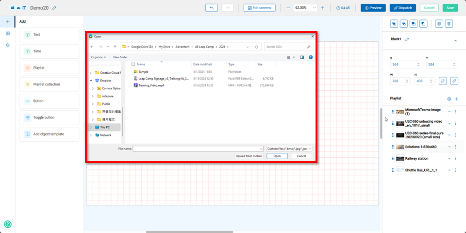
Uploaded Files
By selecting "Upload Files," users can choose media files to upload, which will be directly displayed in the playlist.
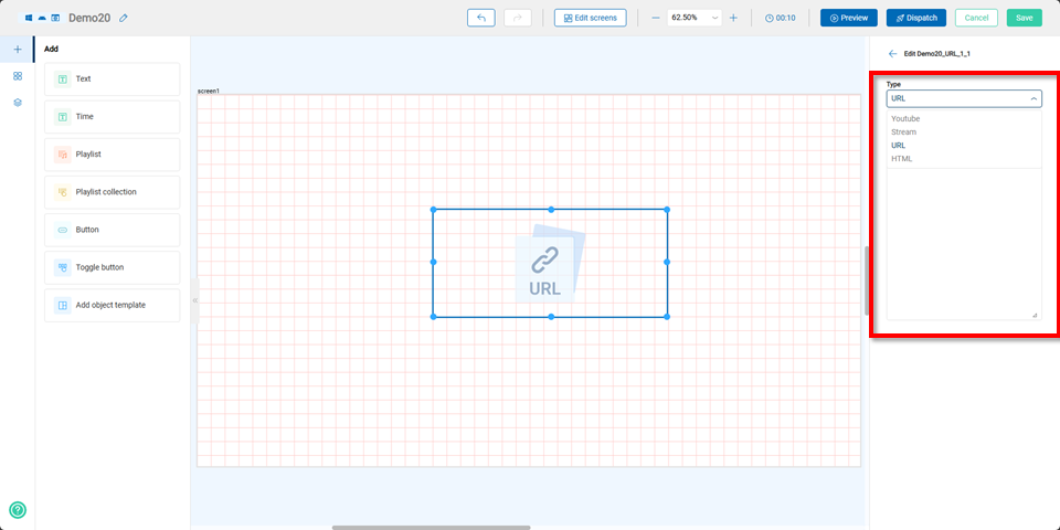
URLs
When selecting URLs, users can choose to add a YouTube link, streaming link, URL, or HTML code.
Note Streaming currently supports only RTSP.
Scrolling
For the Scrolling option, users can choose to use text or an RSS Feed URL.
Note RSS Feedsupports versions 1.0 and 2.0.
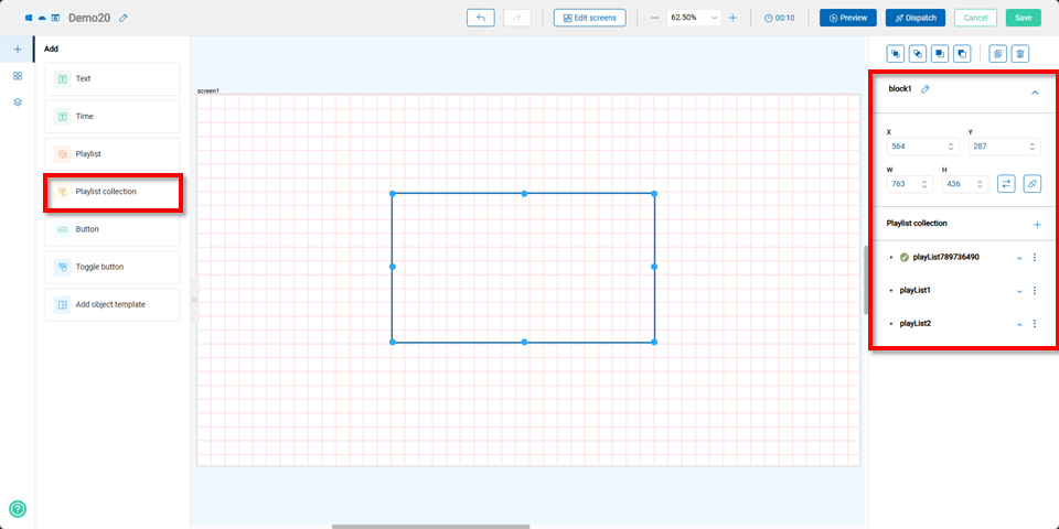
Playlist Collection Component
By selecting the playlist collection component, users can edit its coordinates, size, and multiple playlists on the right panel, allowing for the creation of various playlists based on different needs.!
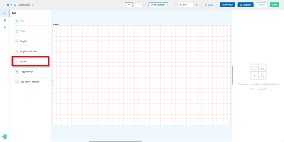
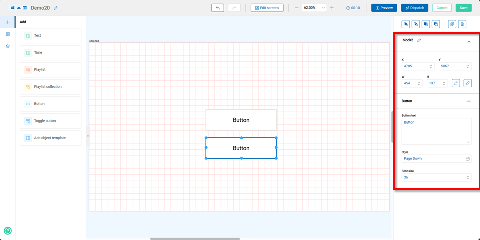
Button Component
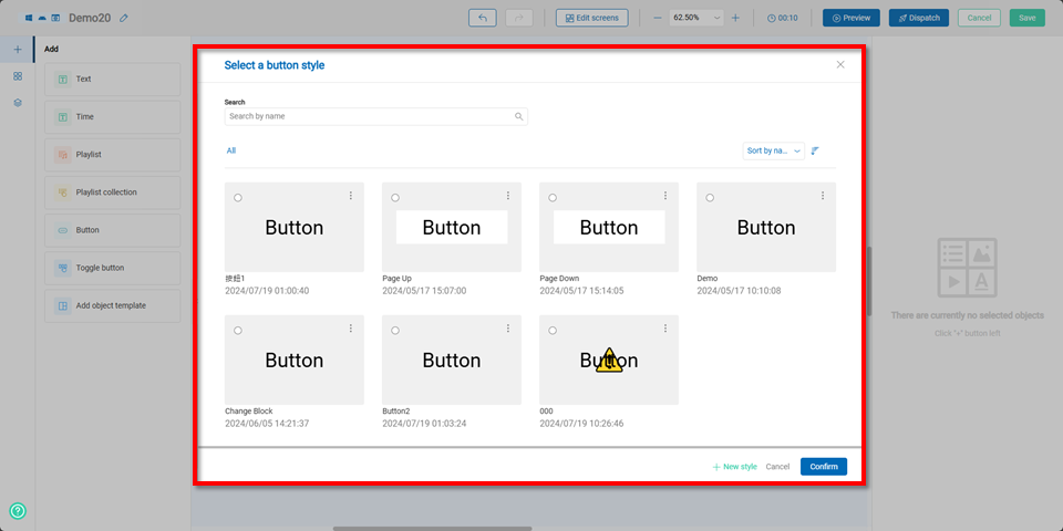
After selecting the button component, users can either choose a previously created button or click the "+ Add Style" button to create a new button.
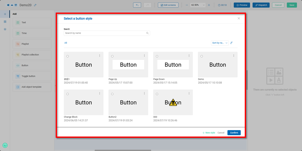
Once completed, users can edit the button’s coordinates, text, style, and font size on the right panel. For more detailed information on how to create and apply buttons, please refer to the guide.Link
Toggle Button Component
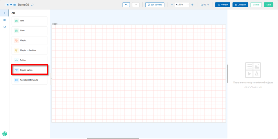
Users can choose a previously created toggle button or click the "+ Add Style" button to create a new one.
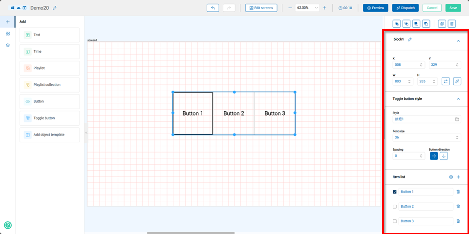
Once completed, users can edit the toggle button’s coordinates, style, font size, spacing, button direction, and item list on the right panel. For detailed instructions on creating and applying toggle buttons, please refer to the 連結
Add Object Template Component
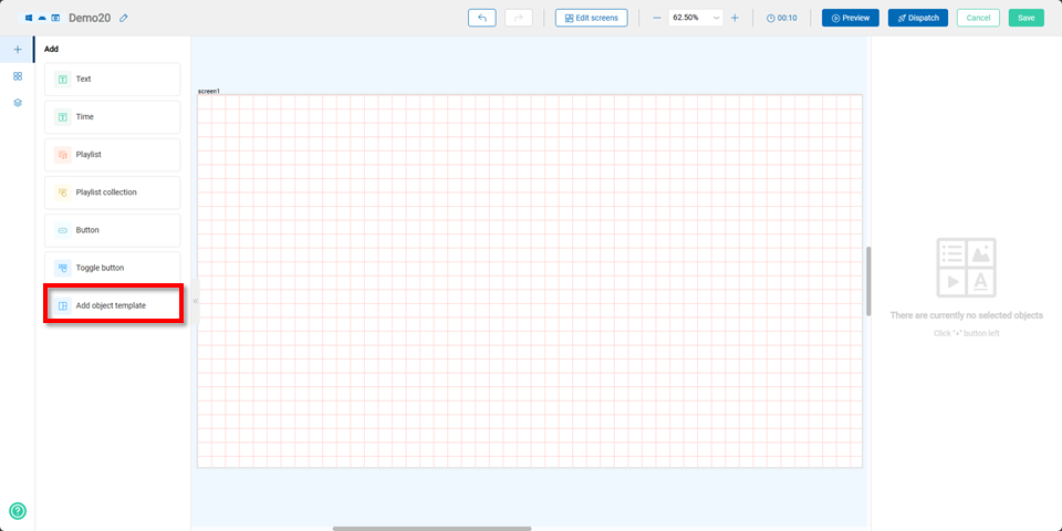
After selecting the "Add Object Template" component, users need to choose the screen to apply it to, as well as whether the template object should be vertical or horizontal.
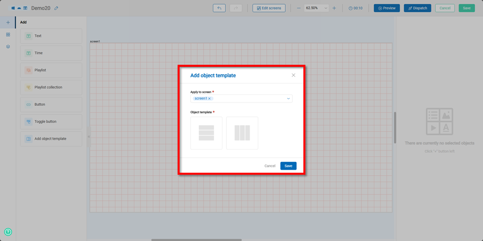
Once completed, the editing area will display three equal blocks, allowing users to add text, time, or playlists to the template.